How to making wonderful CSS text animation? There are two articles about fonts before, about how to define fonts:
Making wonderful CSS text animation
This article will be similar to this article- CSS Fantastic Border Animation . It will talk about some text effects and use different attribute combinations to achieve various text effects.

Google Font
When writing various demos, sometimes some special fonts can better reflect the effect of animation. Here is a little trick to quickly introduce fonts in different formats.
This is the Google Font website, which has a lot of different open source fonts:
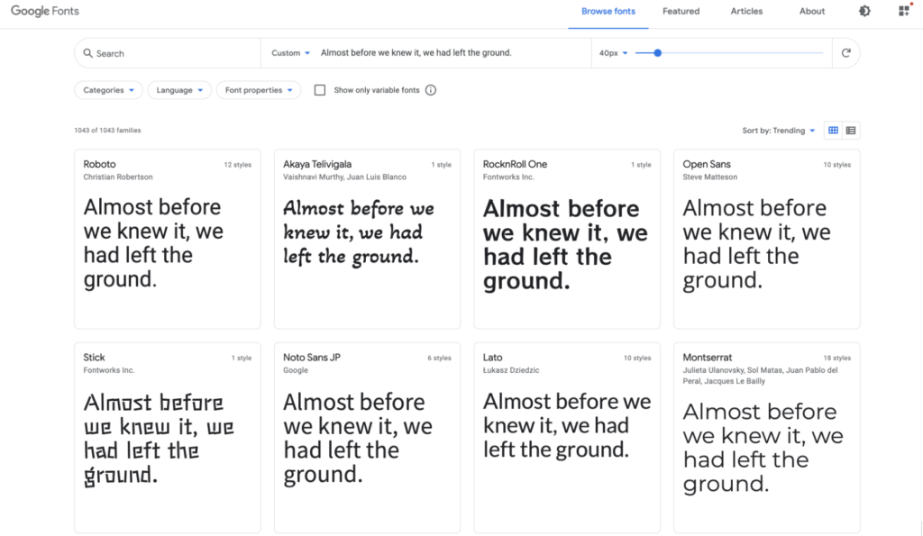
When we match a font that we like, it also provides a very fast and convenient way to introduce it. Select the corresponding font selection +Select this style, it can be linkand @importare two ways to introduce:
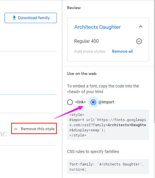
Use linklabels introduced:
<link rel="preconnect" href="https://fonts.gstatic.com">
<link href="https://fonts.googleapis.com/css2?family=Source+Code+Pro:wght@200&display=swap" rel="stylesheet">
OR, in the CSS code, use @importis introduced:
<style>
@import url('https://fonts.googleapis.com/css2?family=Source+Code+Pro:wght@200&display=swap');
</style>
The interior of the two methods are actually used @font-facewas the font definitions.
We can quickly declare and specify a custom font through @font-face . Something like this:
@font-face {
  font-family: "Open Sans";
  src: url("/fonts/OpenSans-Regular-webfont.woff2") format("woff2"),
       url("/fonts/OpenSans-Regular-webfont.woff") format("woff");
}
In this way, using Google Font, we can easily enjoy various fonts.
I often use this method when I need some artistic fonts or special fonts to show different effects in my personal projects or some demos. As for whether it is necessary to introduce some special fonts in the business, it is a matter of opinion.
Next, we will look at different types of fonts in CSS, and the combination of different attributes, can tinker with what kind of effects.
Text and shadow
By combining fonts with font shadows text-shadow, different ways of using shadows produce different effects.
Let’s take a look through a series of Demos.
Long shadow text effect
Through multiple levels, the color gradually changes (transparent) shadow changes, you can generate long shadows:
div {
  text-shadow: 0px 0px #992400, 1px 1px rgba(152, 36, 1, 0.98), 2px 2px rgba(151, 37, 2, 0.96), 3px 3px rgba(151, 37, 2, 0.94), 4px 4px rgba(150, 37, 3, 0.92), 5px 5px rgba(149, 38, 4, 0.9), 6px 6px rgba(148, 38, 5, 0.88), 7px 7px rgba(148, 39, 5, 0.86), 8px 8px rgba(147, 39, 6, 0.84), 9px 9px rgba(146, 39, 7, 0.82), 10px 10px rgba(145, 40, 8, 0.8), 11px 11px rgba(145, 40, 8, 0.78), 12px 12px rgba(144, 41, 9, 0.76), 13px 13px rgba(143, 41, 10, 0.74), 14px 14px rgba(142, 41, 11, 0.72), 15px 15px rgba(142, 42, 11, 0.7), 16px 16px rgba(141, 42, 12, 0.68), 17px 17px rgba(140, 43, 13, 0.66), 18px 18px rgba(139, 43, 14, 0.64), 19px 19px rgba(138, 43, 15, 0.62), 20px 20px rgba(138, 44, 15, 0.6), 21px 21px rgba(137, 44, 16, 0.58), 22px 22px rgba(136, 45, 17, 0.56), 23px 23px rgba(135, 45, 18, 0.54), 24px 24px rgba(135, 45, 18, 0.52), 25px 25px rgba(134, 46, 19, 0.5), 26px 26px rgba(133, 46, 20, 0.48), 27px 27px rgba(132, 47, 21, 0.46), 28px 28px rgba(132, 47, 21, 0.44), 29px 29px rgba(131, 48, 22, 0.42), 30px 30px rgba(130, 48, 23, 0.4), 31px 31px rgba(129, 48, 24, 0.38), 32px 32px rgba(129, 49, 24, 0.36), 33px 33px rgba(128, 49, 25, 0.34), 34px 34px rgba(127, 50, 26, 0.32), 35px 35px rgba(126, 50, 27, 0.3), 36px 36px rgba(125, 50, 28, 0.28), 37px 37px rgba(125, 51, 28, 0.26), 38px 38px rgba(124, 51, 29, 0.24), 39px 39px rgba(123, 52, 30, 0.22), 40px 40px rgba(122, 52, 31, 0.2), 41px 41px rgba(122, 52, 31, 0.18), 42px 42px rgba(121, 53, 32, 0.16), 43px 43px rgba(120, 53, 33, 0.14), 44px 44px rgba(119, 54, 34, 0.12), 45px 45px rgba(119, 54, 34, 0.1), 46px 46px rgba(118, 54, 35, 0.08), 47px 47px rgba(117, 55, 36, 0.06), 48px 48px rgba(116, 55, 37, 0.04), 49px 49px rgba(116, 56, 37, 0.02), 50px 50px rgba(115, 56, 38, 0);
}

Of course, multiple shadows and color of each weight is difficult to write one by one manually, usually need help in writing a long shadow time SASS, LESSto help save time:
@function makelongrightshadow($color) {
    $val: 0px 0px $color;

    @for $i from 1 through 50 {
        $color: fade-out(desaturate($color, 1%), .02);
        $val: #{$val}, #{$i}px #{$i}px #{$color};
    }

    @return $val;
}
div {
    text-shadow: makeLongShadow(hsl(14, 100%, 30%));
}
Three-dimensional shadow text effect
If there are multiple shadows, but the color changes are not so strong, it can create a three-dimensional effect.
div {
  text-shadow: 0 -1px 0 #ffffff, 0 1px 0 #2e2e2e, 0 2px 0 #2c2c2c, 0 3px 0 #2a2a2a, 0 4px 0 #282828, 0 5px 0 #262626, 0 6px 0 #242424, 0 7px 0 #222222, 0 8px 0 #202020, 0 9px 0 #1e1e1e, 0 10px 0 #1c1c1c, 0 11px 0 #1a1a1a, 0 12px 0 #181818, 0 13px 0 #161616, 0 14px 0 #141414, 0 15px 0 #121212);
}

Inline shadow text effect
A reasonable combination of shadow color and background color can achieve a shadow similar to the embedded effect.
div {
  color: #202020;
  background-color: #2d2d2d;
  letter-spacing: .1em;
  text-shadow: -1px -1px 1px #111111, 2px 2px 1px #363636;
}

CodePen Demo – 5 text shadow effects in css3
Neon light effect (Neon)
The neon light effect, called Neon in English, is one of the most common effects I have seen on Codepen. Its principle is very simple, but it can produce very cool effects.
We only need to set 3~n layers of shadow effects, the blur radius of each layer (the third parameter of the text shadow) has a larger interval, and the shadow color of each layer is the same.
p {
    color: #fff;
    text-shadow:
        0 0 10px #0ebeff,
        0 0 20px #0ebeff,
        0 0 50px #0ebeff,
        0 0 100px #0ebeff,
        0 0 200px #0ebeff
}
Of course, usually when using the Neon effect, the background color is black.

Using Neon effects reasonably, you can create a lot of interesting motion effects. For example, the effect that acts on the mouse hover:
p {
    transition: .2s;

    &:hover {
        text-shadow: 0 0 10px #0ebeff, 0 0 20px #0ebeff, 0 0 50px #0ebeff, 0 0 100px #0ebeff, 0 0 200px #0ebeff;
    }
}
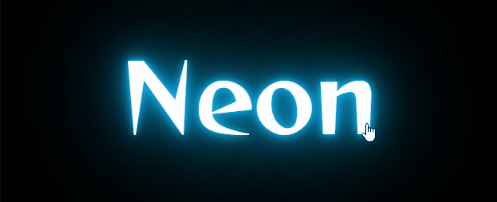
CodePen Demo – Neon Demo
There is a 2K+ Like DEMO on CodePen, which achieves a very good Neon effect. You can poke in and take a look at CodePen – Neon Glow .
You can also select appropriate fonts and cooperate with animation effects to achieve a gradual lighting effect:
<p>
  <span id="n">n</span>
  <span id="e">e</span>
  <span id="o">o</span>
  <span id="n2">n</span>
</p>
p:hover span {
  animation: flicker 1s linear forwards;
}
p:hover #e {
  animation-delay: .2s;
}
p:hover #o {
  animation-delay: .5s;
}
p:hover #n2 {
  animation-delay: .6s;
}

@keyframes flicker {
  0% {
    color: #333;
  }
  5%, 15%, 25%, 30%, 100% {
    color: #fff;
    text-shadow:
      0px 0px 5px var(--color),
      0px 0px 10px var(--color),
      0px 0px 20px var(--color),
      0px 0px 50px var(--color);

  }
  10%, 20% {
    color: #333;
    text-shadow: none;
  }
}
The frame rate of the GIF picture is not enough, and the effect is not very good. You can click on the DEMO below to feel it:
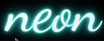
CodePen Demo – Neon Demo
Text and background
The background background in CSS also provides some attributes to enhance the effect of text.
background-clip and text
There is an attribute in the background background-clip, whose function is to set the filling rule of the element’s background (background image or color) .
With box-sizingvalues very similar Generally speaking, it has three values, border-box, , padding-box, content-boxlater added a specification background-clip. Today, some browsers still need to add the prefix webkit for use -webkit-background-clip.
The use of this attribute means that the text in the block is used as the cropping area to be cropped outward, the background of the text is the background of the block, and the area outside the text will be cropped.
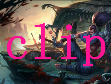
Look at the simplest Demo, without using background-clip:text:
<div>Clip</div>

<style>
div {
  font-size: 180px;
  font-weight: bold;
  color: deeppink;
  background: url($img) no-repeat center center;
  background-size: cover;
}
</style>
The effect is as follows:
CodePen Demo
use background-clip:text
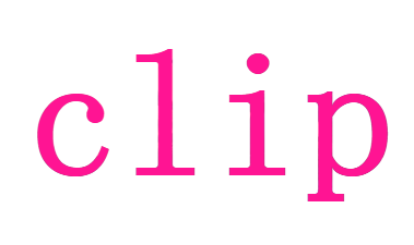
Let’s modify the above code slightly and add -webkit-background-clip:text:
div {
  font-size: 180px;
  font-weight: bold;
  color: deeppink;
  background: url($img) no-repeat center center;
  background-size: cover;
  background-clip: text;
}
The effect is as follows:
CodePen Demo
See here, some people may wonder, is not this character set colorattribute thing.
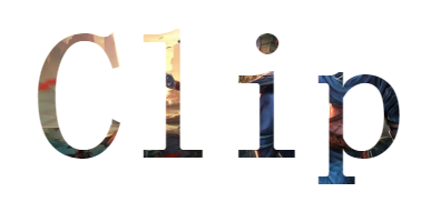
Don’t worry, because the text is set with a color, which blocks the background of the div block, what if the text is set to be transparent? The text can be set to be transparent color: transparent.
div {
  color: transparent;
  background-clip: text;
}
The effect is as follows:
CodePen Demo
By setting clear text, the original div’s background began to unravel, and the area outside of the text have all been cut, and this is background-clip:textthe effect.
Use background-clipgraphics with
In this way, we can choose the appropriate font for the appropriate picture to achieve any style of text effect.

CodePen Demo – background-clip: text & Image text
Or, use this effect to realize a creative poster:
Use background-clipto achieve a gradual text
Furthermore, by using this attribute, you can also easily achieve gradient text:
{
    background: linear-gradient(45deg, #009688, yellowgreen, pink, #03a9f4, #9c27b0, #8bc34a);
    background-clip: text;
}

With background-positionor filter: hue-rotate()make changes gradually up:
{
    background: linear-gradient(45deg, #009688, yellowgreen, pink, #03a9f4, #9c27b0, #8bc34a);
    background-clip: text;
    animation: huerotate 5s infinite;
}

@keyframes huerotate {
    100% {
        filter: hue-rotate(360deg);
    }
}

CodePen Demo – background-clip: text gradient
Use background-clipto increase high-gloss text animation
Using background-clip, we can also easily add highlight animation to the text.
For example:

Its essence is also used background-clip, the pseudo code is as follows:
<p data-text="Lorem ipsum dolor"> Lorem ipsum dolor </p>
p {
    position: relative;
    color: transparent;
    background-color: #E8A95B;
    background-clip: text;
}
p::after {
    content: attr(data-text);
    position: absolute;
    left: 0;
    top: 0;
    width: 100%;
    height: 100%;
    background-image: linear-gradient(120deg, transparent 0%, transparent 6rem, white 11rem, transparent 11.15rem, transparent 15rem, rgba(255, 255, 255, 0.3) 20rem, transparent 25rem, transparent 27rem, rgba(255, 255, 255, 0.6) 32rem, white 33rem, rgba(255, 255, 255, 0.3) 33.15rem, transparent 38rem, transparent 40rem, rgba(255, 255, 255, 0.3) 45rem, transparent 50rem, transparent 100%);
    background-clip: text;
    background-size: 150% 100%;
    background-repeat: no-repeat;
    animation: shine 5s infinite linear;
}
@keyframes shine {
	0% {
		background-position: 50% 0;
	}
	100% {
		background-position: -190% 0;
	}
}
If you remove the pseudo-elements background-clip: text, you can understand the principle:

CodePen Demo – shine Text && background-clip
mask With text
There is also an attribute related to the background – mask.
I have mentioned it in many articles before mask. The more detailed one is the wonderful CSS MASK . This article does not explain the basic concept of mask too much. When reading down, if you are confused about the usage of some masks , you can go again. Take a look.
Just remember that the core, the use of maskthe most important conclusion is: add an element mask property, overlapping transparent part of its content will be represented by the mask gradient, and the overlapping part will become transparent.
Using mask, we can achieve special effects of various characters:
<div>
    <p>Hello MASK</p>
</div>
Core CSS code:
div {
    mask: radial-gradient(circle at 50% 0%, #000, transparent 30%);
    animation: scale 6s infinite;
}
@keyframes scale {
    0% {
        mask-size: 100% 100%;
    }
    60%,
    100% {
        mask-size: 150% 800%;
    }
}
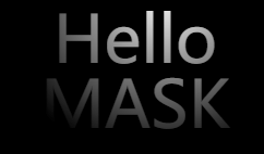
Change in a different direction, or something like this:

CodePen Demo – MASK Text Effect
Text and blending mode (mix-blend-mode) and filters (filter)
Next, come to the very interesting blending modes and filters. These two properties add a lot of fun to the CSS world, and it is flexible to use, and you will sigh that CSS is so powerful and beautiful.
There have been many, many articles on blending modes and filters before, so I won’t go into details about some basic usages.
Add a border to the text to generate hollow text
In CSS, we can use -webkit-text-strokeit to quickly add a border to the text. Using this, we can quickly generate hollow text:
p {
    -webkit-text-stroke: 3px #373750;
}

Of course, we see that property used -webkit-text-strokewith the webkitprefix, there are some compatibility issues.
Therefore, earlier, we will also use text-shadowto generate hollow text.
p {
    text-shadow: 0 0 5px #fff;
}

It can be seen that because of the use of shadows, there is a clear feeling of blur, and there are certain blemishes.
There is also a very convoluted method, which can also generate hollow text by using the blending mode and the filter.
p {
    position: relative;
    color: #fff;

    &::after {
        content: 'Magic Text';
        position: absolute;
        left: 0;
        top: 0;
        color: #fff;
        mix-blend-mode: difference;
        filter: blur(1px);
    }
}

Here we use filter: blur(1px)to generate a little little freshman than the original font font overlaid on top of the original font, re-use mix-blend-mode: differenceeliminated some of the same color, leaving only the use of multi-blur filter out that part.
mix-blend-mode: difference: Difference mode (Difference), the function is to view the color information in each channel, compare the background color and the drawing color, and subtract the pixel value of the darker pixel from the pixel value of the brighter pixel. Mixing with white will reverse the background color; mixing with black will not change.
The schematic animation is as follows:

CodePen Demo – Hollow TEXT EFFECT
Use blending mode to generate gradient color cutout text
Well, back to the top -webkit-text-stroke, get a hollow word, we can also use mixed mode mix-blend-mode: multiplygenerate gradient text.
mix-blend-mode: multiply: Multiply, multiply the pixel values of two colors, and then divide by 255 to get the pixel value of the final color. Usually the color after the multiply mode is executed is darker than the original two colors. Any color and black multiplying will still get black, any color and white multiplying will keep the original color unchanged, and executing this mode with other colors will produce the effect of lighting in this color in a dark room.
p {
    position: relative;
    -webkit-text-stroke: 3px #9a9acc;

    &::before{
		content: ' ';
		width: 100%;
		height: 100%;
		position: absolute;
		left: 0;
		top: 0;
		background-image: linear-gradient(45deg, #ff269b, #2ab5f5, #ffbf00);
		mix-blend-mode: multiply;
	}
}

Here, mix-blend-mode: multiplythe function is very similar to the mask. We actually generate a gradient pattern, but the gradient color will only appear within the outline of the text.
Of course, the above effects are also related to the overall black background color.
The schematic diagram is as follows:

CodePen Demo – Hollow TEXT EFFECT
Use blending mode to generate text with light and shadow effects
OK, on the basis of the above, we can continue to mix overlay mode, this time we use a free ::afterpseudo-class, and then add a mix-blend-mode: color-dodgehybrid model, add text to the final embellishment to achieve wonderful lighting effects.
mix-blend-mode: color-dodge: Color dodge mode (Color Dodge), check the color information of each channel, reduce the “contrast” to brighten the color of the background color to reflect the drawing color, and the black blend does not change. .
Core pseudo code:
p {
    position: relative;
    -webkit-text-stroke: 3px #7272a5;

    &::before {
		content: ' ';
		background-image: linear-gradient(45deg, #ff269b, #2ab5f5, #ffbf00);
		mix-blend-mode: multiply;
    }

    &::after {
        content: "";
        position: absolute;
        background: radial-gradient(circle, #fff, #000 50%);
        background-size: 25% 25%;
        mix-blend-mode: color-dodge;
        animation: mix 8s linear infinite;
    }
}

@keyframes mix {
    to {
        transform: translate(50%, 50%);
    }
}
See the effect:

Here we must lament mix-blend-mode: color-dodgethe magic, and get rid of this hybrid mode, in fact, it is this:

CodePen – Hollow TEXT EFFECT
Okay, can we continue with the above effect? The answer is yes. Due to space limitations, this article will not continue to delve into this effect, and those who are interested can take the above DEMO and try again.
Use the blending mode to achieve the effect of inverting the text and the background color
Here is the use of mix-blend-mode: differencethe difference mode, text and background to implement a color anti Title effect.
mix-blend-mode: difference: Difference mode (Difference), the function is to view the color information in each channel, compare the background color and the drawing color, and subtract the pixel value of the darker pixel from the pixel value of the brighter pixel. Mixing with white will reverse the background color; mixing with black will not change.
The code is very simple, we implement a black and white background, the color of the text is white, and with the difference mode, the text on the black background is white, and the text on the white background is black.
p  {
    background: repeating-radial-gradient(circle at 200% 200%, #000 0, #000 150px, #fff 150px, #fff 300px);

    &::before {
        content: "LOREM IPSUM";
        color: #fff;
        mix-blend-mode: difference;
    }
}
Can be used for some title effects:

CodePen Demo – Radial-gradient + Mix-blend-mode
Use mixed mode to achieve dynamic vibrato style glitch effect
OK, next, let’s try other blending modes. In the article CSS Failure Art , a kind of failure art is mentioned.
What is glitch art? The LOGO of Douyin, as we know it, is just one of the manifestations of malfunction art. It has a magical feel, it looks like it has flickering and vibrating effects, which is very eye-catching.
key point
- Use the mix-blend-mode: lighten blending mode to realize the overlapping part of the two text structure is white
- Use element displacement to complete the dislocation moving animation to form a visual impact effect
See the effect:

This article is a bit long, the code is not up, the complete DEMO is here:
TikTok-like LOGO text failure effect
Of course, we don’t have to use the blending mode to make the fusion part white, we can just use this color matching effect, based on another version of the above effect, without using the blending mode.
key point
- Use pseudo-elements to generate two copies of the text
- The visual effect is completed by displacement, mask, and blending modes
- The color matching draws on the style of Douyin’s LOGO

The complete demo is here:
CSS text glitch effect
The advantage of just using color schemes without using blending modes is that for each copy of text, there is a greater moving distance and room for processing.
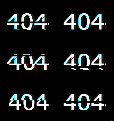
Glitch Art style 404 effect
Slightly replace the text copy as 404, and add some filter effects ( hue-rotate(), blur()) Hehe, I found a scene that may actually be available:
Effect one:
Effect two:
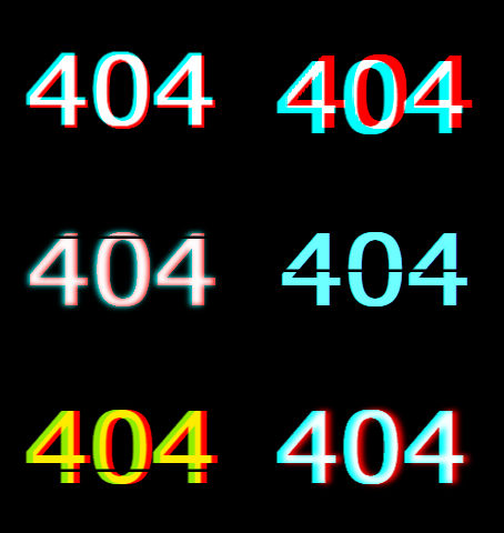
The demos of the two 404 effects are as follows:
Tips when using mixed mode, sometimes, undesirable effects and background mixed together, can be used
isolation: isolatein isolation.
Use filters to generate text fusion effects
In you do not know CSS filter techniques and details in an article, we describe a fusion effect using the filter implementation.
The blending effect produced by the blur filter and the contrast filter is used .
Take out the two filters separately, their functions are:
filter: blur(): Set the Gaussian blur effect to the image.filter: contrast(): Adjust the contrast of the image.
However, when they “fitted together”, a wonderful fusion phenomenon occurred. Simple example:

CodePen Demo – filter mix between blur and contrast
Using this feature, you can achieve some text fusion effects:
Using this method, we can also design some text fusion effects:


You can see the specific implementation here:
CodePen Demo – word animation | word filter
Text and SVG
Finally, let’s take a look at text and SVG.
SVG and CSS in the mix, there is a class of very suitable used to do animation property, which is stroke-*associated with several properties, use them, we only need to have a simple SVG syntax, you can quickly create an animation-related lines.
We use several attributes related to borders and lines in SVG to realize the line animation of the text. The following is a list. In fact, most of them are very easy to understand in comparison with CSS, but the name is changed:
- stroke-width: analogy to border-width in css, set the border width for svg graphics;
- stroke: analogy to border-color in css, set the border color for svg graphics;
- stroke-linejoin | stroke-linecap: set the style of line segment connection;
- stroke-dasharray: The value is an array with no upper limit. Each number alternately represents the width of the stroke and interval;
- stroke-dashoffset: the offset of the dashed line
For a more in-depth introduction, please take a look at this article: [Web Animation] Introduction to SVG Line Animation
Line text animation
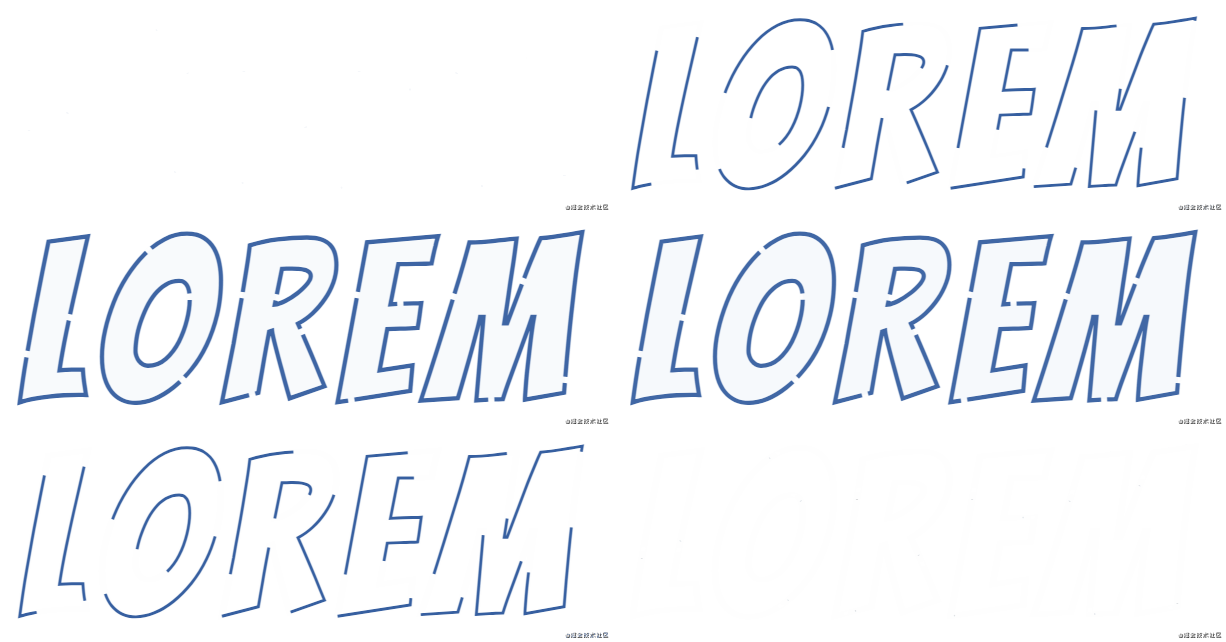
Next, we use stroke-*the relevant property, to achieve a simple line of text animation.
<svg viewBox="0 0 400 200">
	<text x="0" y="70%"> Lorem </text>
</svg>
svg text {
	animation: stroke 5s infinite alternate;
	letter-spacing: 10px;
	font-size: 150px;
}
@keyframes stroke {
	0% {
		fill: rgba(72, 138, 20, 0);
		stroke: rgba(54, 95, 160, 1);
		stroke-dashoffset: 25%;
		stroke-dasharray: 0 50%;
		stroke-width: 1;
	}
	70% {
		fill: rgba(72, 138, 20, 0);
		stroke: rgba(54, 95, 160, 1);
		stroke-width: 3;
	}
	90%,
	100% {
		fill: rgba(72, 138, 204, 1);
		stroke: rgba(54, 95, 160, 0);
		stroke-dashoffset: -25%;
		stroke-dasharray: 50% 0;
		stroke-width: 0;
	}
}
Core Animation is the use of dynamic changes in the text stroke-dasharrayand stroke-dashoffsetform lines on the visual transformation, and finally give the text color animations. See the effect:
CodePen Demo – SVG Text Line Effect
<svg viewBox="0 0 400 200">
	<text x="0" y="70%"> Lorem </text>
</svg>
@import url("https://fonts.googleapis.com/css2?family=Bangers&family=Homemade+Apple&family=Sacramento&display=swap");

html, body {
	width: 100%;
	height: 100%;
	display: flex;
	font-family: "Bangers", cursive;
	background: #fff;
}

svg {
	width: 600px;
	height: 300px;
	margin: auto;
}

svg text {
	text-transform: uppercase;
	animation: stroke 5s infinite alternate;
	letter-spacing: 10px;
	font-size: 150px;
}
@keyframes stroke {
	0% {
		fill: rgba(72, 138, 20, 0);
		stroke: rgba(54, 95, 160, 1);
		stroke-dashoffset: 25%;
		stroke-dasharray: 0 50%;
		stroke-width: 1;
	}
	50% {
		fill: rgba(72, 138, 20, 0);
		stroke: rgba(54, 95, 160, 1);
		stroke-width: 2;
	}
	70% {
		fill: rgba(72, 138, 20, 0);
		stroke: rgba(54, 95, 160, 1);
		stroke-width: 3;
	}
	90%,
	100% {
		fill: rgba(72, 138, 204, 1);
		stroke: rgba(54, 95, 160, 0);
		stroke-dashoffset: -25%;
		stroke-dasharray: 50% 0;
		stroke-width: 0;
	}
}
At last
This article introduces some text animation tips that I think are more interesting. Of course, there are many interesting text effects in CSS. Due to space limitations, they will not be expanded one by one.
More wonderful CSS technical articles are summarized in my Github – iCSS , which is continuously updated. Welcome to click a star to subscribe to the collection.
If you have any questions or suggestions, you can exchange more, original articles, limited writing style, and lack of knowledge. If there are any irregularities in the article, please let me know.
Reference: https://www.cnblogs.com/coco1s/p/14498283.html


