In this post, I will introduce some knowledge about CSS gradient art, using some very small units, and only a few lines of code can produce a wonderful and interesting background effect~
The effect of magnitude on background graphics. The main topic of this article are:
- Repeating-radial-gradient
- Repeating-conic-gradient
CSS gradient art
What is the order of magnitude to the background graphics? Let’s look at such an interesting phenomenon:
We use repeating-conic-gradient multiple angular gradients to achieve a graph, the code is very simple, as shown below:
<div></div>
div {
    width: 100vw;
    height: 100vh;
    background: repeating-conic-gradient(#fff, #000, #fff 30deg);
}
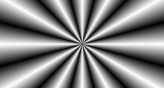
Replace 30deg with 0.1deg
Then, we replace 30deg in the above code with a very small value, similar to this:
{
    background: repeating-conic-gradient(#fff, #000, #fff 0.1deg);
}
What is this stuff? Brainstorm, what will the graph drawn by this line of code look like?
See the effect:
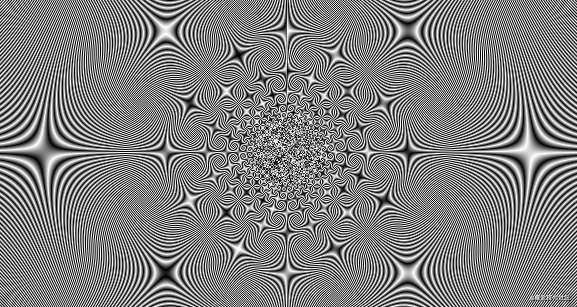
Wow, incredible. Here 0.1deg is very important. The smaller the angle here (less than 1deg is better), the cooler the graphics, which is the magnitude of the impact on the background graphics.
CodePen – One Line CSS Pattern
Observe the change process with CSS @property
Before, if we directly wrote the following transition code, we could not get the tween transition animation, there would only be frame-by-frame animation:
div{
    background: repeating-conic-gradient(#fff, #000, #fff 0.1deg);
    transition: background 1s;
}

div:hover {
    background: repeating-conic-gradient(#fff, #000, #fff 30deg);
}
Only this effect can be obtained because CSS does not support direct transition animation for such complex gradients:
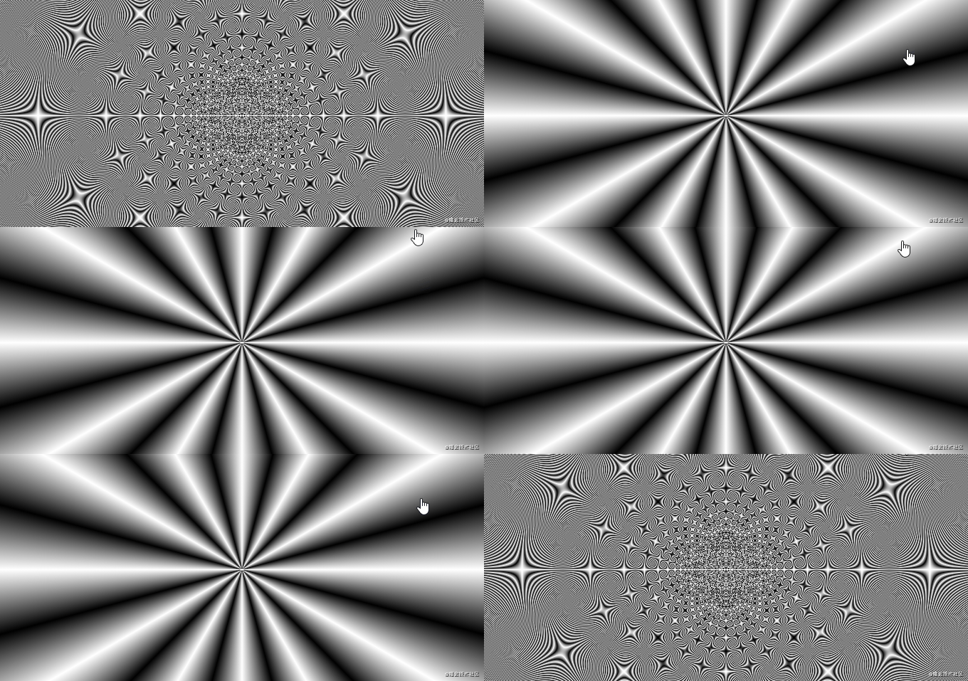
OK, Next, use in this article – CSS the @Property, make the impossible become possible introduction of CSS @propertyknowledge, we can use CSS @propertyto look at the process of changing their two states.
Simply modify the code, the core code is as follows:
@property --angle {
  syntax: '<angle>';
  inherits: false;
  initial-value: 0.1deg;
}
div{
    background: repeating-conic-gradient(#fff, #000, #fff var(--angle));
    transition: --angle 2s;
}
html:hover {
    --angle: 30deg;
}
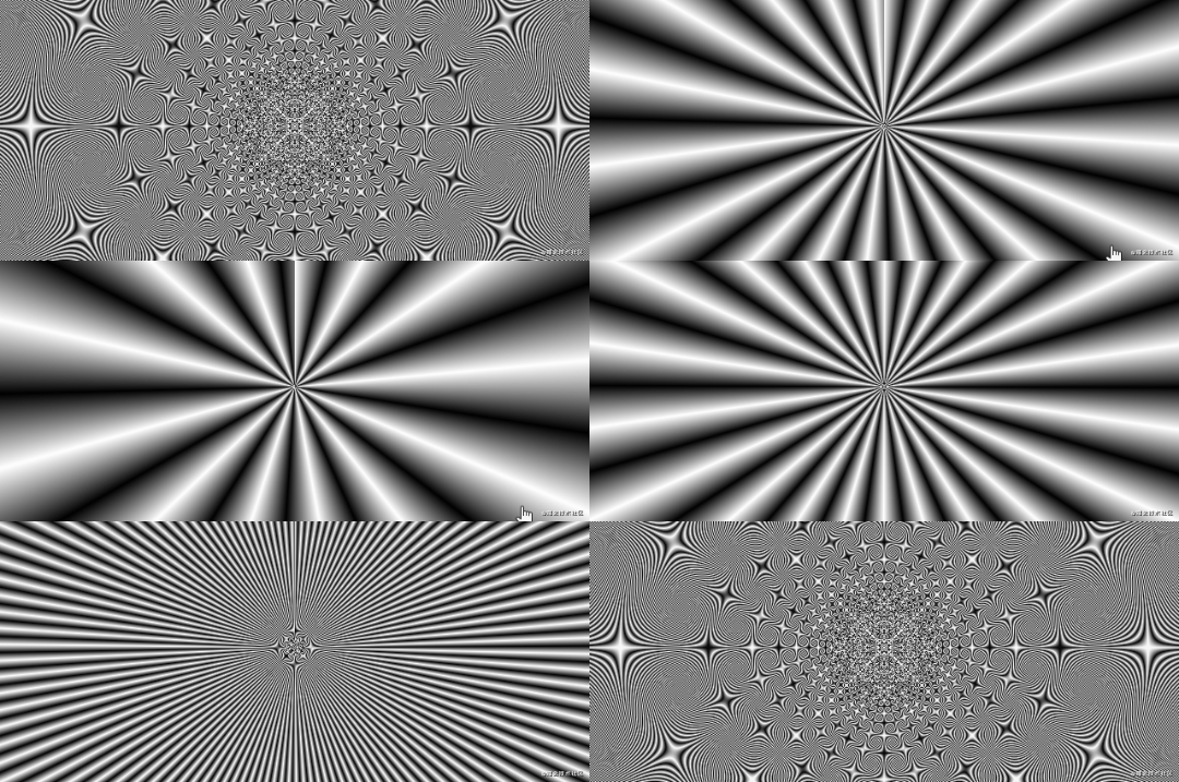
Wow, in order to find the influence of different units of magnitude on this graphic, he got a very magical transition animation effect. It is strongly recommended that you click into DEMO to feel the effect of the down conversion:
CodePen – repeating-conic-gradient CSS Pattern Transition (Only Chrome 85+)
By CSS @property realization tween transition animation, as seen from 30degthe 0.1degprocess of change, we can generally see small units 0.1deghow to influence graphics.
At the same time, the smaller the unit, the more details of the picture, and you can try it yourself.
Multiple radial gradients & multiple angular gradients with small units to achieve interesting backgrounds
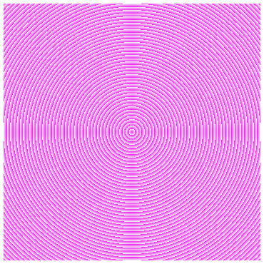
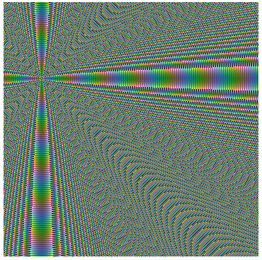
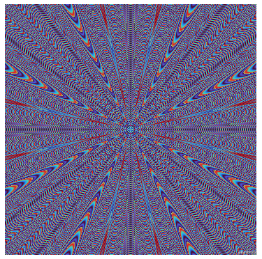
Using some of the above tips, we can generate some very interesting background images by using repeating-radial-gradient and repeating-conic-gradient.
Briefly list some:
div {
    background-image: repeating-radial-gradient(
        circle at center center,
        rgb(241, 43, 239),
        rgb(239, 246, 244) 3px
    );
}
div {
    background-image: repeating-radial-gradient(
        circle at 15% 30%,
        rgb(4, 4, 0),
        rgb(52, 72, 197),
        rgb(115, 252, 224),
        rgb(116, 71, 5),
        rgb(223, 46, 169),
        rgb(0, 160, 56),
        rgb(234, 255, 0) 2px
    );
}
div {
    background-image: repeating-radial-gradient(
        circle at center center,
        rgb(81, 9, 72),
        rgb(72, 90, 223),
        rgb(80, 0, 34),
        rgb(34, 134, 255),
        rgb(65, 217, 176),
        rgb(241, 15, 15),
        rgb(148, 213, 118) 0.1px
    );
}
div {
    background-image: repeating-radial-gradient(
        ellipse at center center,
        rgb(75, 154, 242),
        rgb(64, 135, 228),
        rgb(54, 117, 214),
        rgb(43, 98, 200),
        rgb(33, 79, 185),
        rgb(22, 60, 171),
        rgb(12, 42, 157),
        rgb(1, 23, 143) 0.01px
    );
}
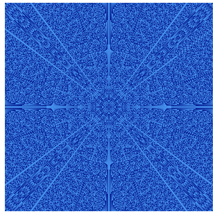
Hey, don’t you have something to say? You can try more interesting graphics yourself. For the complete DEMO code, you can click here to see:
CodePen Demo – Magic Gradient Art
How small can the smallest be?
repeating-radial-gradientIt is similar to radial-gradient()and uses the same parameters, but it will repeat the colors in all directions, so as to cover the entire container.
Take the following code as an example. The end point of a single drawing 1pxis the focus of this article. How small can it be?
:root {
    --length: 1px
}
{
    background-image: repeating-radial-gradient(
        circle at 17% 32%,
        rgb(4, 4, 0),
        rgb(52, 72, 197),
        rgb(115, 252, 224),
        rgb(116, 71, 5),
        rgb(223, 46, 169),
        rgb(0, 160, 56),
        rgb(234, 255, 0) var(--length)
    );
}
I’ve 100pxto 0.00001px draw the 8 graphics as a comparison:


In 0.001pxto 0.0001pxthis range segment, the graphics have been basically reduced to particle shape, did not see the outline of a radial gradient, but to 0.00001px this level, actually degraded to a solid color pictures!
Use repeating-radial-gradient to realize TV snowflake noise animation
In the DEMO, we found that when 0.001pxto 0.0001pxthe region segment, repeating-radial-gradientthe basic pattern to particle degradation:
{
    background-image: repeating-radial-gradient(
        circle at 17% 32%,
        rgb(4, 4, 0),
        rgb(52, 72, 197),
        rgb(115, 252, 224),
        rgb(116, 71, 5),
        rgb(223, 46, 169),
        rgb(0, 160, 56),
        rgb(234, 255, 0) 0.0008px
    );
}
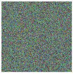
Isn’t this very similar to the effect of a TV snowflake screen? Fine-tuning 0.0008pxthis parameter, the use of several different frames of animation, we can get the snow noise of the television animation.
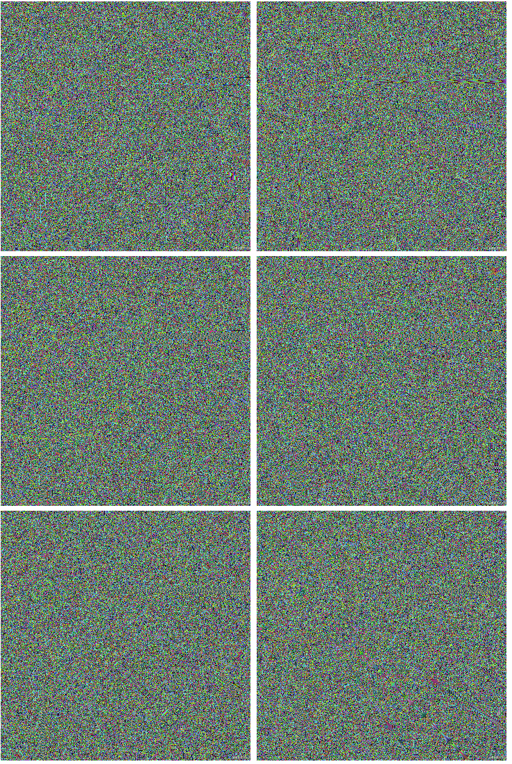
Aha, very interesting, you can click here for the complete source code:
Copepen Demo – PURE CSS TV NOISE EFFECT (Only Chrome 85+)
At last
What can a few lines of background code do? It’s definitely more than that, of course, isn’t this just the fun of CSS. Want to get the most interesting CSS information, don’t miss my iCSS official account – iCSS front-end interesting facts
Okay, this concludes this article, I hope it helps you?
More wonderful CSS technical articles are summarized in my Github – iCSS , which will be updated continuously. Welcome to click a star to subscribe to the collection.
If you have any questions or suggestions, you can exchange more, original articles, limited writing style, and lack of knowledge. If there are any irregularities in the article, please let me know.
reference: https://www.cnblogs.com/coco1s/p/14703485.html


